Guangzhou’s Nansha district unveils new logo
Guangzhou’s Nansha district, dubbed “Pearl in the Guangdong-Hong Kong-Macao Greater Bay Area” and the “place of rise”, has released its new logo.
The new design was created by the publicity department of CPC Nansha District Committee and a well-known domestic strategy consultancy firm.

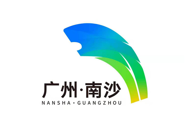
The new logo of Guangzhou’s Nansha district [Photo/gznsnews.com.cn]
The logo features a design inspired by both the Nansha district map and an awe-inspiring lion, with the Chinese and English characters of “Nansha · Guangzhou” under the lion.
The “map” is an irreplaceable feature of the district, and the “lion” implies a forward-looking spirit, revealing the district’s developing conception of creating excellence in a new era for the development of socialism with Chinese characteristics.
The lion is also a messenger of China and foreign exchange, which represents Nansha’s strategic positioning of itself as a high-level opening-up portal.
Notably, the design inherits elements of the Japanese banana leaf from the original logo, conveying the green and ecological connotations of the district.
The blue and green colors go well with each other. The former symbolizes ocean and technology, and the latter represents the natural environment and sustainable development. The combination of the colors not only embodies the local urban appearance, but also reflects the district’s conception of green development.
The design realizes an integration of artistry and applicability, showing Nansha’s urban spirit of innovation, gumption, ecology and vigor.
All rights reserved. Presented by China Daily


